

Back to all project overviews
EdtechAccessibilityUX DesignResponsive Web

Case study

UCFHere

Making university attendance clearer, more accessible, and more resilient across devices.

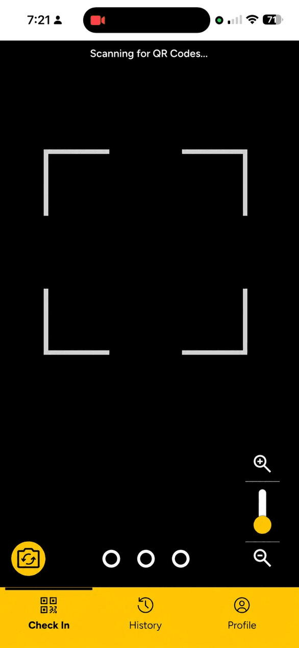
UCFHere now centers the student around the scan, confirms success clearly, and gives specific recovery paths when the environment gets in the way.

Role
UX Designer
Organization
UCF Center for Distributed Learning
Timeline
June-July 2026
Platform
Responsive web application and Canvas integration
Tools
Figma, Claude Design, Figma Make
Responsibilities
Information architecture, user flows, prototyping, interaction design, responsive design, accessibility, error handling, developer collaboration

Placeholder

Add a large hero mockup or product image here. A full-width desktop scan state would work well.

01

Project introduction

UCFHere introduction

UCFHere is the University of Central Florida's primary attendance and engagement platform, used by more than 50,000 students each month. Students use the application to scan course-specific QR codes, confirm attendance, and review attendance history through Canvas.

I led an end-to-end redesign of the student experience, restructuring the navigation, redesigning the QR check-in flow, creating a responsive attendance record system, and designing recovery experiences for device and browser issues.

02

Context

Context

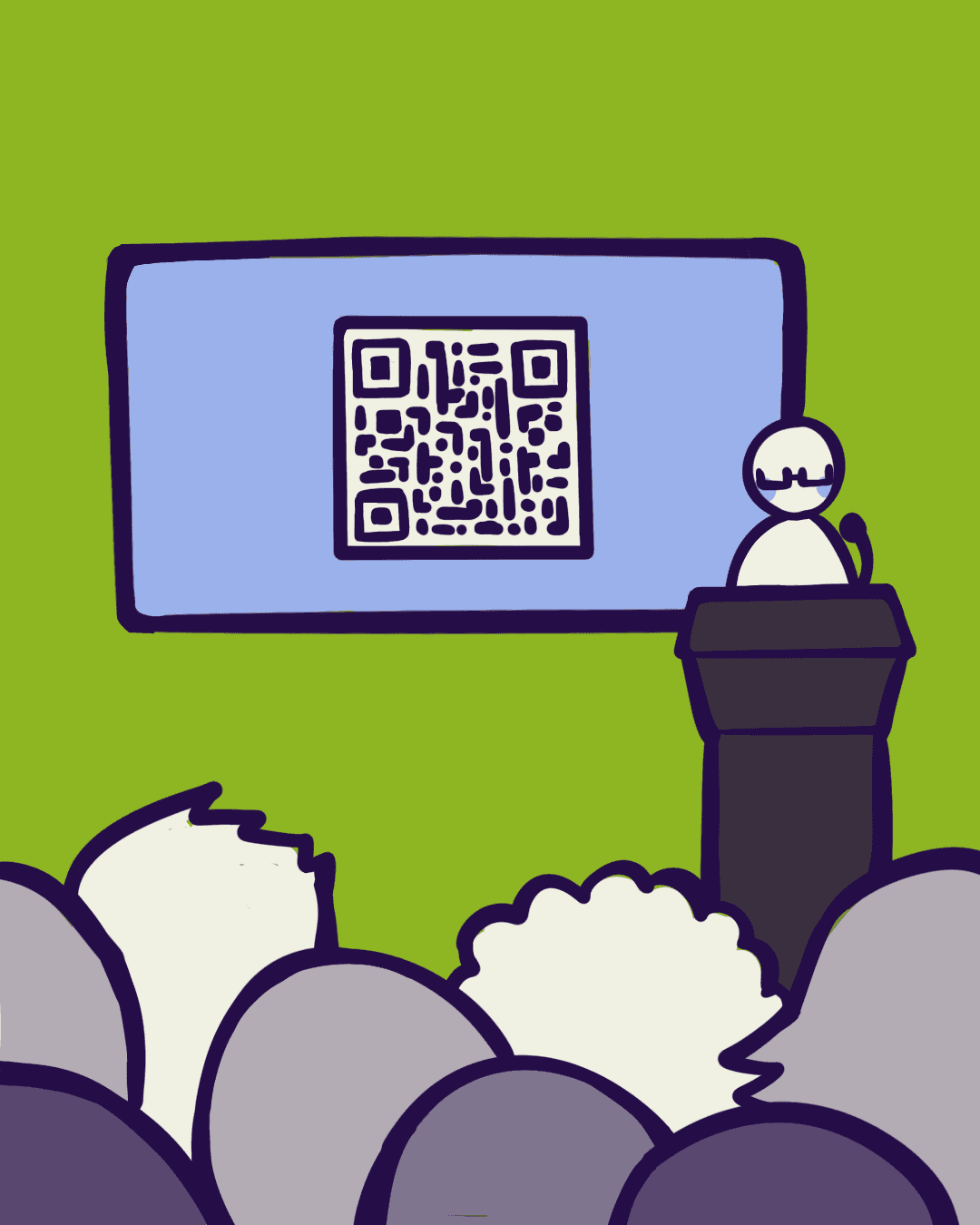
Scanning a class QR code is a tiny interaction on paper, but it happens inside a very short window and carries real consequences if it fails. A student who is unsure whether attendance has been recorded is not just dealing with a UI problem; they are dealing with a class-time problem.

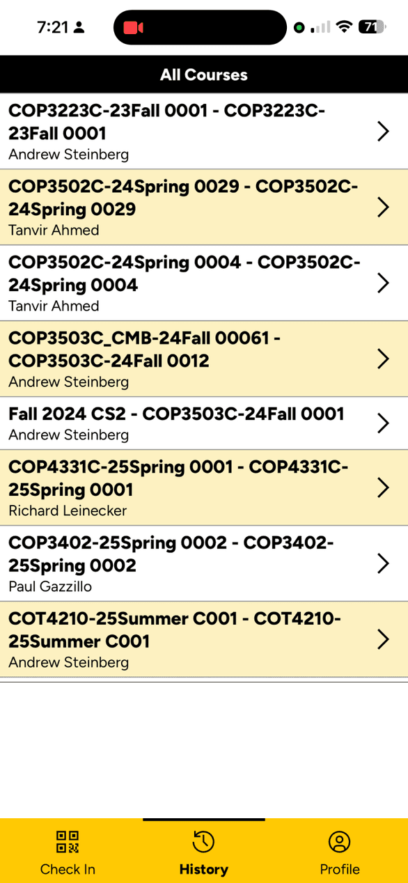
The application had to support more than the scanner itself. Students also needed a way to review attendance records, understand their current status within individual courses, access settings, and get help if something went wrong.

The redesign needed to answer three questions at almost every stage: what is happening, was the action successful, and what should the student do next?

Placeholder

Add a small context diagram here showing UCFHere, Canvas, class QR codes, and student devices.

03

The problem

The problem

Placeholder

Add a current-state scan flow screenshot or illustration here showing where the experience becomes unclear.

Attendance is a small action with high consequences. When the scan path breaks, the experience can feel ambiguous instead of reassuring, especially when the student is inside a time-limited classroom moment.

Students could encounter disabled camera permissions, unsupported browser behavior, failed QR scans, connectivity problems, or uncertainty about whether their attendance had actually been recorded.

01

Camera permission friction

Placeholder

Add a mobile UI screenshot here showing the camera permission denied state and the recovery action.

Students need a clear explanation and recovery path when the browser blocks camera access before scanning can even begin.

02

Unclear scan failures

Placeholder

Add a mobile UI screenshot here showing the failed scan state, retry feedback, or a helpful error explanation.

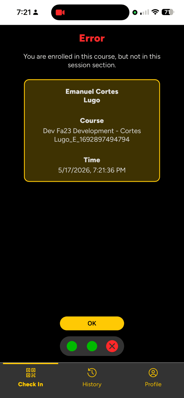
Failed QR scans should tell students what went wrong and how to try again without making the error feel generic.

03

Uncertain confirmation state

Placeholder

Add a mobile UI screenshot here showing the success confirmation state on a phone screen.

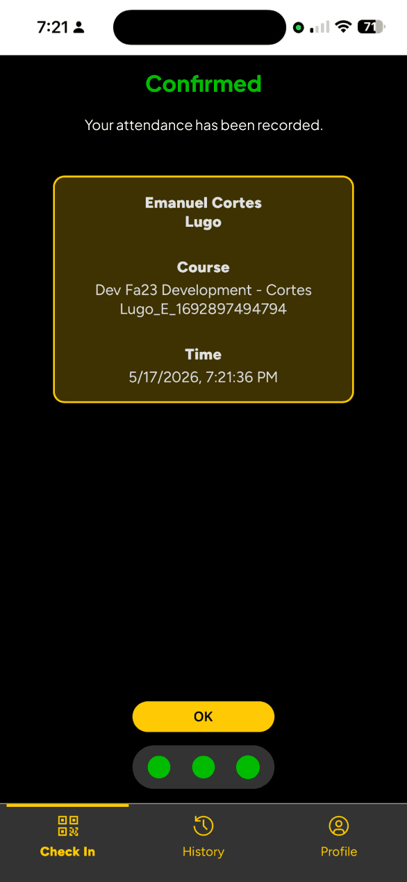
After a successful scan, the interface still has to make the result obvious so students do not leave confused.

04

Project goal

Project goals

Main goal

Make the primary attendance flow fast, clear, and easy to trust.

01

Prioritize the primary student action

Scanning a QR code is the most time-sensitive action in the product and should remain the dominant action throughout the experience.

02

Create unmistakable system feedback

Students should never have to wonder whether a scan worked or whether attendance was submitted successfully.

03

Design beyond the happy path

Permission errors, failed scans, connectivity issues, and unsupported environments need distinct explanations and recovery actions.

04

Improve access to attendance information

Students need a clearer way to review attendance by course, understand attendance status, and move between recent and historical records.

05

Current-state experience

Current-state experience

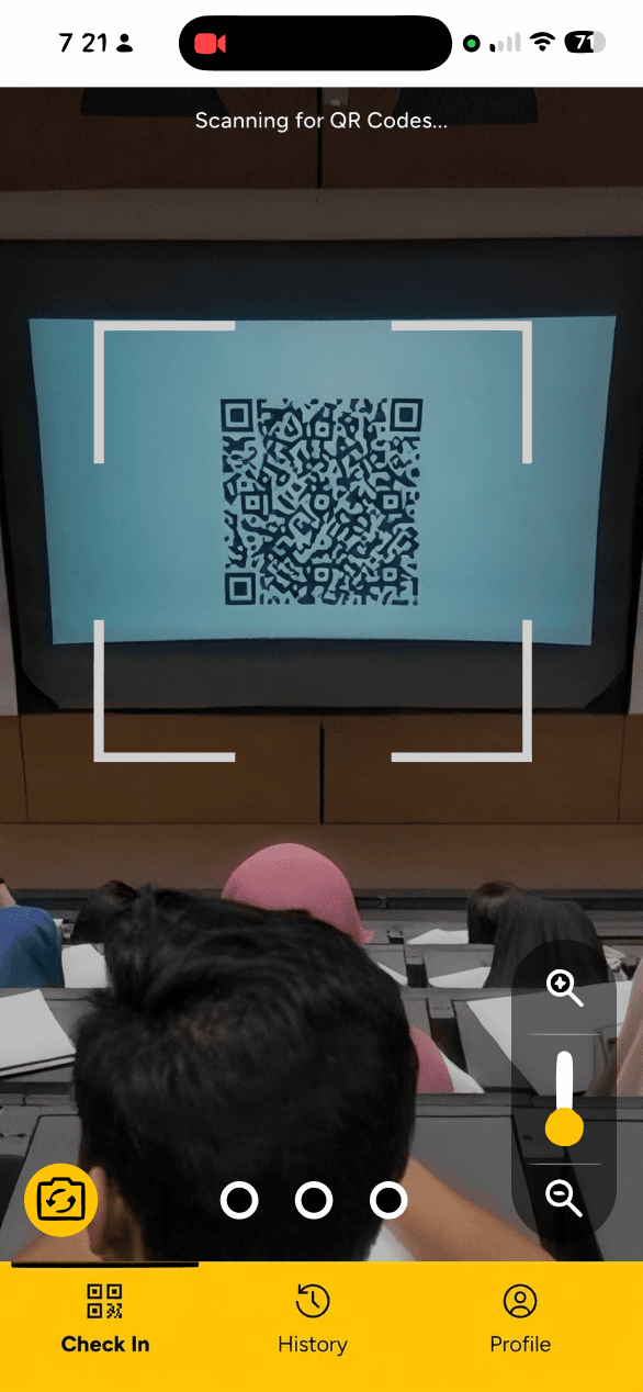
I mapped the full student journey rather than treating the QR scanner as an isolated screen. The central flow was open UCFHere, scan a course QR code, receive confirmation, and then either scan again or return to the dashboard.

01

Open UCFHere

Students enter through a task-focused dashboard or the scan flow directly.

02

Scan a course QR code

The camera and code reader need to feel immediate and unambiguous.

Friction: Permission prompts, unsupported browsers, and unreadable codes can interrupt the flow before the scan even starts.

03

Receive confirmation

Successful scans need a clear, unmistakable confirmation state.

Friction: A success message that is too subtle can leave students uncertain about whether attendance was recorded.

04

Return to dashboard or scan again

Students should have a clear next action after the scan finishes.

The highest-friction point is not the scan itself; it is the moment when the student cannot tell whether the failure is temporary, device-specific, or final.

06

Design approach

Design approach

I moved between low-fidelity flows and high-fidelity interaction prototypes to test hierarchy, spacing, content density, and system behavior. The process was broken into a few focused chapters so the redesign reads like a notebook rather than a generic product timeline.

01

Dashboard hierarchy

Reduced competing visual weight so the scan action, attendance status, and secondary destinations are easier to read at a glance.

02

Scan confirmation

Explored success states that stay in context instead of sending students to a disconnected success page.

03

Error recovery

Separated camera, browser, code, and network failures so the interface can tell students what happened and what to do next.

04

Attendance records

Reworked the record view around course selection and predictable scrolling for quicker verification on mobile.

01

System feedback and error recovery

Challenge: The application needed to communicate success and failure in a way that students could understand instantly while they were still in the middle of the attendance action.

Decision: I treated feedback as a system, not a message, and created distinct states for success, camera permission issues, browser issues, invalid scans, and connectivity problems.

Reasoning: Students should never be left guessing whether the issue is temporary, whether the environment is unsupported, or whether attendance already went through.

Placeholder

Add an annotated error-state sequence here, such as permission denied, unsupported browser, and connectivity recovery.

02

Designing beyond the successful path

Challenge: Many classroom tools only look polished when everything works correctly, but attendance is most stressful when something breaks.

Decision: I designed for the failure states first-class, with a matrix that maps the technical issue to the interface message, recovery action, and support guidance.

Reasoning: A generic 'try again' loop would not help if the actual problem was a denied permission or unsupported device.

Placeholder

Add a browser/device error matrix or troubleshooting diagram here.

03

Reworking attendance records

Challenge: The attendance history needed to support quick verification without turning into a long, undifferentiated list of dates.

Decision: I reorganized the records around the student's course structure, with a clearer weekly view and a broader monthly overview.

Reasoning: Students should be able to confirm a recent check-in quickly and still understand longer-term patterns when needed.

Placeholder

Add a course attendance record mockup here, showing weekly and monthly views.

04

Responsive and accessible behavior

Challenge: UCFHere is used in active classroom environments across many device sizes and browser setups, so the interface has to stay stable under imperfect conditions.

Decision: I designed the experience to keep keyboard focus visible, make touch targets large enough, keep status messages readable without relying on color alone, and preserve camera-based alternatives when scanning is unavailable.

Reasoning: Accessibility is part of the interaction architecture, not a final visual check, especially for an action that students may need to complete quickly.

Placeholder

Add mobile and desktop responsiveness examples here, such as scanner states and record views.

Design decision

Keep success in context

Problem: A separate success page would confirm the scan, but it would also break the student out of the moment and make the flow feel heavier than it needs to be.

Decision: Use a bottom-sheet style confirmation above the scanner so the student stays oriented while still receiving unmistakable feedback.

Reasoning: This keeps the interaction honest about what just happened, preserves the connection to the original scan, and gives the student two clear next actions without forcing a full page change.

Placeholder

Add a scan confirmation mockup here showing the bottom-sheet style success state.

07

Final product

Final product

The final experience centers the primary scan action, clarifies what is happening during the scan, and gives students a better path through both success and failure states.

Placeholder

Add the final desktop product mockup here. A full-width overview of the dashboard would work well.

Placeholder

Add a mobile state here. A scanning or attendance-record screen would show responsive behavior clearly.

A dashboard centered on the most likely student action.
Clear success confirmation that stays in context.
Specific recovery flows for camera, browser, and connectivity issues.
Attendance records organized for faster verification and less friction.

08

Responsiveness and accessibility

Accessibility and responsive behavior

Placeholder

Add a mobile accessibility screenshot here showing responsive behavior, focus states, or a touch-friendly interaction.

Accessibility and responsiveness

Accessibility was treated as part of the interaction architecture rather than a final visual review. That mattered because students may need to complete the attendance process quickly and under imperfect conditions.

  • Clear keyboard focus states and touch-target sizing.
  • Status communication that does not rely only on color.
  • Screen-reader-friendly labels for icons and scanning controls.
  • Responsive layouts without clipped or hidden actions.
  • Predictable page-level scrolling instead of nested scroll containers.
  • Plain-language error messages and direct recovery actions.
  • Visible alternatives when camera-based interaction is unavailable.
  • Reduced ambiguity in buttons, instructions, and troubleshooting steps.

09

Outcomes and reflection

Outcomes and reflection

Placeholder

Add an outcomes screenshot or short demo clip here showing the final product, success state, or reflection slide.

Outcomes and reflection

This redesign established a more cohesive foundation for UCFHere's student-facing experience. It simplified navigation, made the scan action easier to locate, clarified successful attendance submission, replaced generic errors with condition-specific recovery flows, and improved attendance record organization.

The biggest takeaway was that a reliable experience does more than help users succeed. It helps them understand what happened when they cannot succeed immediately and gives them a clear path forward. Because implementation and evaluation are ongoing, I would not attribute unsupported numerical improvements to the redesign.

Add implementation screenshots once the updated UI is in the codebase.
Validate camera and browser behavior across more classroom devices.
Expand the error matrix as browser requirements change.